Effective May 2025 until superseded. This concise, text‑focused guide outlines MLCCS visual and editorial standards.
1 · Brand Overview & Scope
1.1 Purpose & Goals
- Deliver cost‑efficient, tailored cloud solutions on par with global leaders.
- Provide a dependable, sustainable, and innovative developer experience.
- Champion transparent pricing and responsive support.
1.2 Core Services
- Compute – VMs, elastic scaling, container orchestration
- Network – CDN, DNS, load balancing with SLA ≥ 99.9 %
- Data – managed databases, object storage (triple‑replicated)
- AI – model deployment, GPU clusters, inference gateways
- DevOps – CI/CD pipelines, monitoring, 24 × 7 incident response
1.3 Target Clients
- Start‑ups seeking rapid scaling
- Research institutes requiring HPC & data retention
- Enterprises migrating legacy workloads
2 · Brand Culture & Tone
- “Formal, Futuristic, Technological.”
- Communication style: confident, precise, inclusive.
- Preferred voice: active, customer‑centric, jargon‑light.
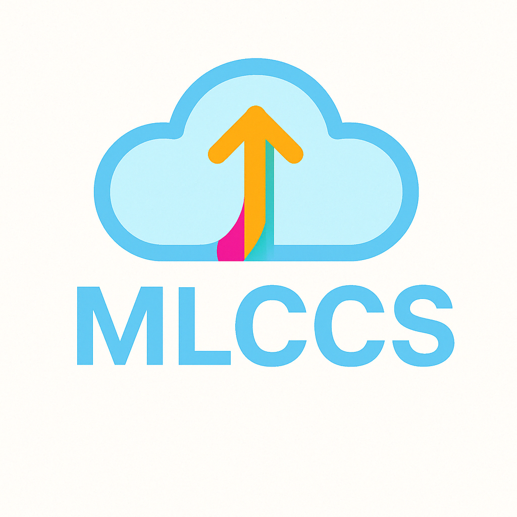
3 · Logo & Icon Guidelines
3.1 Full Logo
- Required on primary pages, print assets, and partner decks.
- Minimum width – 160 px (screen) / 40 mm (print).
- File formats –
.svg(preferred),.png(fallback).
3.2 Icon‑Only
- CLI splash, favicon (
32 × 32 px), mobile app icon. - Maintain safe‑zone radius = 15 % icon width.
3.3 Colour & Clear Space
- Palette strictly limited to brand colours.
- Clear space ≥ 12 px or ½ x (where x = logo height) – whichever is larger.
3.4 Incorrect Usage
- ❌ Stretch, skew, rotate, or outline.
- ❌ Apply drop shadows or gradients.
- ❌ Change colours or overlay on low‑contrast imagery.
4 · Typography
- Primary font – “Noto Sans”; fallback system sans.
- Headings weight 600; body text weight 400.
- Line length target – 60–75 characters.
- Heading hierarchy:
<h1>reserved for page title only.
5 · Text‑Only Usage
- Permitted for legal notices, spec sheets, technical docs.
- Body copy size – 1 rem (16 px); line‑height 1.6.
- Important notices may use bold; avoid underlining.
6 · Colour System
- Primary Blue #3FA7D6 – links, buttons
- Accent Amber #F5B642 – highlights, data visualisation
- Accent Raspberry #C74C6A – warnings, callouts
- Surface #FFFFFF / #1F1F1F – cards, panels
- Background #F2F4F7 / #141414 – app canvas
- Accessibility target: contrast ratio ≥ 4.5:1 for text elements.
All rules are subject to revision. For assets & clarifications, contact admin@lixinchen.ca.